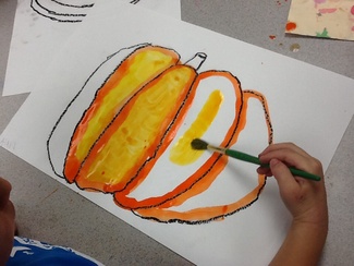
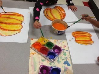
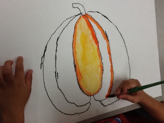
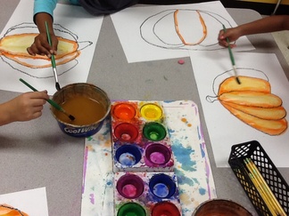
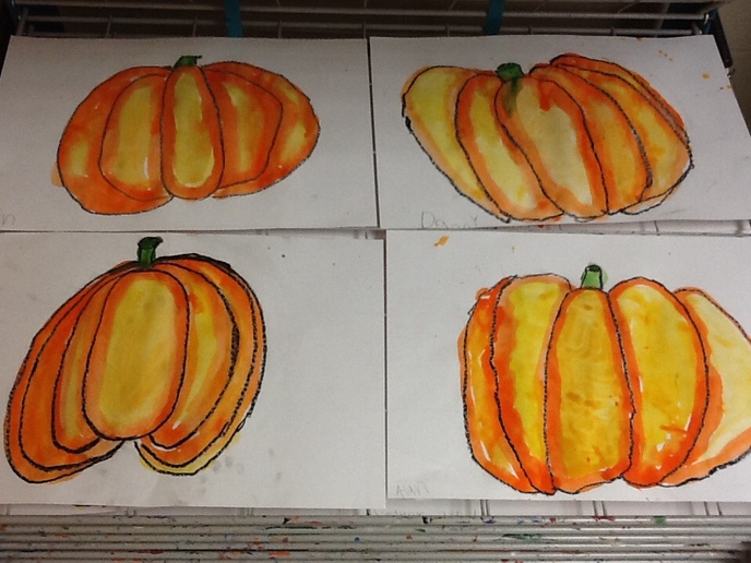
Our pumpkins are really popping off the page in first grade. We looked at my finished example and saw that I painted my orange pumpkin with two colors, orange & yellow. Why? Well many of my first graders agreed that using both colors makes the pumpkin look more realistic. I explained that the yellow area is a highlighted area of the pumpkin and it makes it look like the pumpkin is bumping out, rather than flat on the side. We practiced this concept by painting each section of our pumpkin with an orange outline and then filling the center with yellow. The materials that we used for this project were black oil pastel (for an outline) and tempera paint cakes.
5 Comments
Emily
10/30/2014 11:31:31 am
These pumpkins are great! What kind of paper do you use for tempera cakes? Ours are never that bright!
Reply
11/3/2014 12:44:50 am
I used sulphite drawing paper, premium weight, by Pacon. I do have the kids spend some time stirring their brushes around in the paint to create rich colors on the paper.
Reply
Jessica S
10/5/2015 01:24:40 pm
I was wondering if you had them follow a template or decide how to draw the actual pumpkin themselves.
Reply
Sara Danno
10/14/2015 01:41:00 pm
I drew along with them on the board. I started with the oval in the center of the pumpkin, then added curved lines to each size, and finally the stem on top.
Reply
K
10/17/2015 05:19:20 pm
I think that these would be even better if you let them use a little masking fluid ahead of painting to make highlights. They are awesome and I think I'm teaching this next week! Thanks!
Reply
Your comment will be posted after it is approved.
Leave a Reply. |
Grande Park
|